The ads have been a white square since you first changed the site.
I even tried with ad blocking off yesterday.
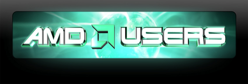
the sigs
maybe move the amd up a bit, or do something with the bottom half where it goes over the dots?
addit:
i vote top
Printable View
The ads have been a white square since you first changed the site.
I even tried with ad blocking off yesterday.
the sigs
maybe move the amd up a bit, or do something with the bottom half where it goes over the dots?
addit:
i vote top
addit:
well, the top one goes better with this site, the bottom would look nice on other's pages where there is no green to match.
beer - i just did a SOB one to match as i felt them not matching would look very bad and seeing as SOB couldn't change i had no chance of getting votes.
http://www.outoffocusonline.com/oli/hard6.jpg
if you look in the properties you will see it is called "hard 6" --as i didnt have the font i had to make the "17" manually and it was VERY difficult. I couldnt make the top shine part of the 7 so i left it in the end.
meckano if that is what you think please vote in the other topic.
i haven't been here in a while... but the place seems to load up like 100 times faster on my computer. i blink and its already loaded. good deal.
http://www.outoffocusonline.com/oli/hard6.jpg
Tis fine with me......
See if Jeff will change it.....
jeff where i changed my sig the background colours on that screen are very bright, can you darken it a little more so it is more inkeeping with the other shads of green used.